How Netflix Taps Into Font Psychology to Tell a Story and Find Its Audience

Netflix knows that its ever-expanding subscriber base is made up of countless personalities and preferences, and its library of original content reflects that. There are comedies, dramas, sci-fi epics, mysteries, and action romps all just a click away—but with so many different shows to choose from, these series need a unique look to hook an audience right from the main menu.
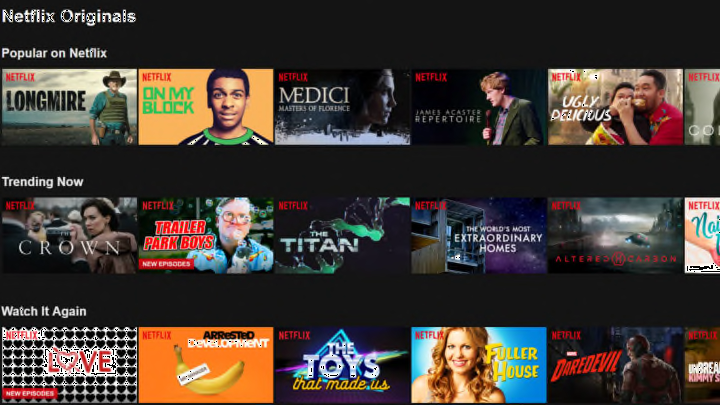
Whether you realize it or not, one of Netflix’s main tools to grab your attention is its choice of font. Just take a look through Netflix’s original programming menu and you’ll see dozens of different fonts used for their shows, each one designed to give you a specific feel that’s consistent with the series's tone.
Sara McGuire, editor for the data visualization website Venngage, broke down the streaming giant’s use of eclectic fonts and how they influence the psychology of a viewer as they browse through the menus. She first listed the four categories of fonts: Decorative (quirky, fun); Headline (bold, dramatic); Modern (forward-thinking, efficient); and Handwritten (personal, playful). Then she explained that a font could either be Serif or Sans Serif style—the former utilizes embellishments on the end of letters while the latter is more minimalist and less formal.
McGuire says “design plays a big role in how we perceive the value of a product,” and that extends to how these fonts remain faithful to what you'll experience when watching each show.
The Crown, for example, has a font that McGuire describes as a Headline with a Serif style, which gives it a “traditional and respectable” feel, much like the Royal Family itself. Meanwhile, Luke Cage has a decorative font, serving as a callback to the bold, in-your-face lettering found on a comic book cover. And if you watched the show, you’ll know the font’s granite lettering is a perfect fit for the bulletproof superhero from Harlem.
Then there are some that are a bit more obvious, like GLOW’s decorative neon font establishing an ‘80s setting, Altered Carbon’s futuristic lettering, or Ozark’s signature Z masquerading as a money sign. While these fonts do give a feel for the show, they're more upfront with the information they're looking to convey.
To get a better sense of what McGuire is going for, try to imagine a series like Chef's Table or Master of None using the rigid font of The Crown or Medici: Masters of Florence. For people basing their opinion solely on the menu picture and font, they would likely have a completely different set of expectations for the series.
Along with posters, trailers, and all the other promotional material, fonts are just one tool Netflix uses to get its content noticed. As McGuire points out, the streaming giant has a firm understanding of a font’s power and its ability to give people a feel for a new series. Next time you're browsing Netflix's selection, take an extra moment to examine the fonts used for each option—it might help you find your next favorite show.