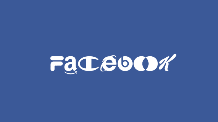
'Brand New Roman' is a Fun Mashup of All the Corporate Logos You Know and Love

Brand New Roman is not your average typeface. You'll probably never find it in the drop-down menu of Microsoft Word or see it on a sign, but it's instantly recognizable. That's because each letter is based off a famous company's logo, as Digital Arts reports.
Designed by the creative agency Hello Velocity, the typeface uses a relevant logo to form letters. The a looks like the Amazon logo. The d is formed by that iconic Disney swoop. The e is the Internet Explorer logo. The w is WordPress. The k is Kellogg's. In total, Hello Velocity used 76 different corporate logos to create the typeface, so some letters are represented with multiple logos—like the s, which is represented by the Skype logo in most cases, but occasionally appears as the Suzuki logo.
As the cheeky website for the project explains, "Brand New Roman is the most corporate Corporate Font ever created! Now all your content can be sponsored content, and sponsored by everybody!" It's Nice That rightfully likens the result to the eye-boggling Wingdings, though this one is admittedly a lot more readable.
Digital Arts points out that there's a fair chance that there might be some copyright infringement going on, so you'd better enjoy it while you can. You can download it to use on your own projects or check out the Firefox and Chrome plugins, which will turn every website you visit into a showcase for Brand New Roman.
[h/t Digital Arts]